Friday, December 31, 2010
Yellowhead golf course, Vehicle wrap design.
This is the design for a 2010 Dodge Ram. Once it has been printed and installed I will update with photos.
Wednesday, December 29, 2010
2011 Golf Award Designs (YH)
Tuesday, December 28, 2010
Blueprint concepts
These are what were preliminary concepts for Blueprint Financial Ltd.
In the end the decided the wordmark was sufficient for their needs. no argument here.
Tuesday, December 7, 2010
Thursday, December 2, 2010
Braand.ca Ski-Doo Graphics
This is a Sled Wrap I designed for Braand Apparel.
It can be ordered on their website: www.braand.ca
Printed by Printwerx.ca.
i hope to have Photos of an installed kit soon.
Tuesday, November 30, 2010
Rejected Design
This design was rejected for a local dealership's promo vehicle.
Cut-Vinyl, to keep the cost down.
They said "They don't understand it"
comments anyone?
Monday, November 15, 2010
Interior Motocross Association -Spec Logos
Speculative design for group's logo. we want to get them to order their award plaques through Printwerx.ca, so we are doing up some designs to show just what we can do for them.
The Green stars are the ones I like.
top ones, with the maple leaf, intended to be a play upon the Canadian Motocross Racing Association (CMRC)'s Logo.
The Green stars are the ones I like.
top ones, with the maple leaf, intended to be a play upon the Canadian Motocross Racing Association (CMRC)'s Logo.
Kelowna Dirt Bike Club - Logos - Spec ideas.
These are a bunch of Speculative designs fro the Kelowna Dirt Bike Club.
Mostly done to entice the Western Conference of the CMRC to use us (printwerx.ca) for their design, and award plate needs.
Which one would you pick? they are just starting points, but I hope they work for some.
Mostly done to entice the Western Conference of the CMRC to use us (printwerx.ca) for their design, and award plate needs.
Which one would you pick? they are just starting points, but I hope they work for some.
Monday, November 8, 2010
Terra Timber Logo Ideas
Logo ideas for Terra Timber inc.
They Chose the top left, but are still going through colour options at the time of this post.
Sometimes the simplest is what they are after.
It'll look good on the trucks, so I'm in agreement.
Friday, November 5, 2010
Prince George Heritage Signs 2010
The City of Prince George is putting up heritage information signs in specific locations around town.
Another designer here at printwerx, and myself worked on this project.
This years additions are shown below. Expect more in the years to come.
Click on the images to view them large enough to read.
Thursday, November 4, 2010
Huber Farm Equipment, Logo and Sign
The arrow points left or right, depending on which side you are standing on.
Top, is the final sign , installed next to the highway, right at the turn off you take to get to their sales lot.
Thursday, October 28, 2010
SharpKnives R Us - Logo
This is the design I did for Sharpknives R Us.
Double sided. the bottom 2 are back options.
A come-to-you professional knife and blade sharpening service.
Saturday, September 25, 2010
Bus Benches for Realtor
Now why do Realtor have their face on everything? That's easy. It's because any Realtor can show you any house, but they want you too choose them. They are the product. The Realtor experience. Because you can sell your house without them, but it sure is easier with them.
Here is a local Realtor bus bench advertisements that I designed.
Here is a local Realtor bus bench advertisements that I designed.
* the white at the corners was cropped out by the frame they are placed into
Wednesday, September 22, 2010
YellowHead & PineValley's Golfing Award Plaques
Yellowhead Grove's Award Plaques:
Golfing Award Plaques for YellowHead Grove Golf Course. Same client as Pine Valley Golf course, thus the reason they look the same.
The putting champion was changed to a joint award between the two courses, so this design replaced the farther above putter's award.
PineValley's Awards:
Monday, August 30, 2010
Huber Farm Equipment, Logo
This is the chosen logo for Huber Farm Equipment, Prince George, BC
Time for design: Roughly 7.5 hours.
I don't consider this logo to be very high on the scale of conceptually designed items. Thus the low time usage.
I feel it is a strong visual logo, but not necessarily the one i would have chosen. see my other concepts here.
Logo concepts.
One of these may, or may not be the final selection for them to use. I'll post the final selection later.
The basis of the design is to remain primarily typographical. As this is a visible trend within the agricultural equipment industry. Another reason I am staying typographical, or making more of a word-mark, is because of the limited geographical range of the company. They sell and service the equipment, but they don't make the equipment.
My choice for the logo would be the top set, top left. we'll see what they pick soon.
Monday, August 23, 2010
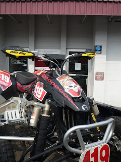
Octane Power Sports Motocross Graphics
Here are 2 kits I have designed and were ordered by Octane Powersports Apparel
Want something like it? Order at www.printwerx.ca
Wednesday, August 18, 2010
Subscribe to:
Comments (Atom)


